SIMPLE IS SMART
We worked closely alongside Suryamani to develop a new purpose for the brand. It’s all about clearing headspace, allowing users to focus on what matters most.
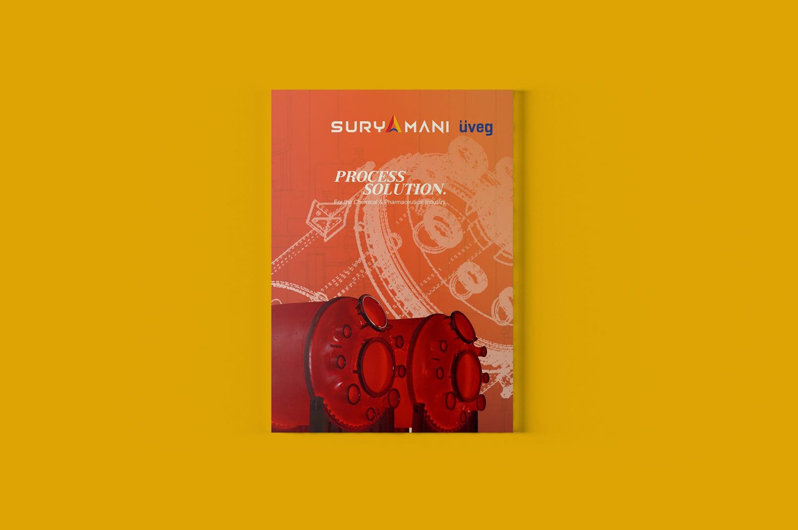
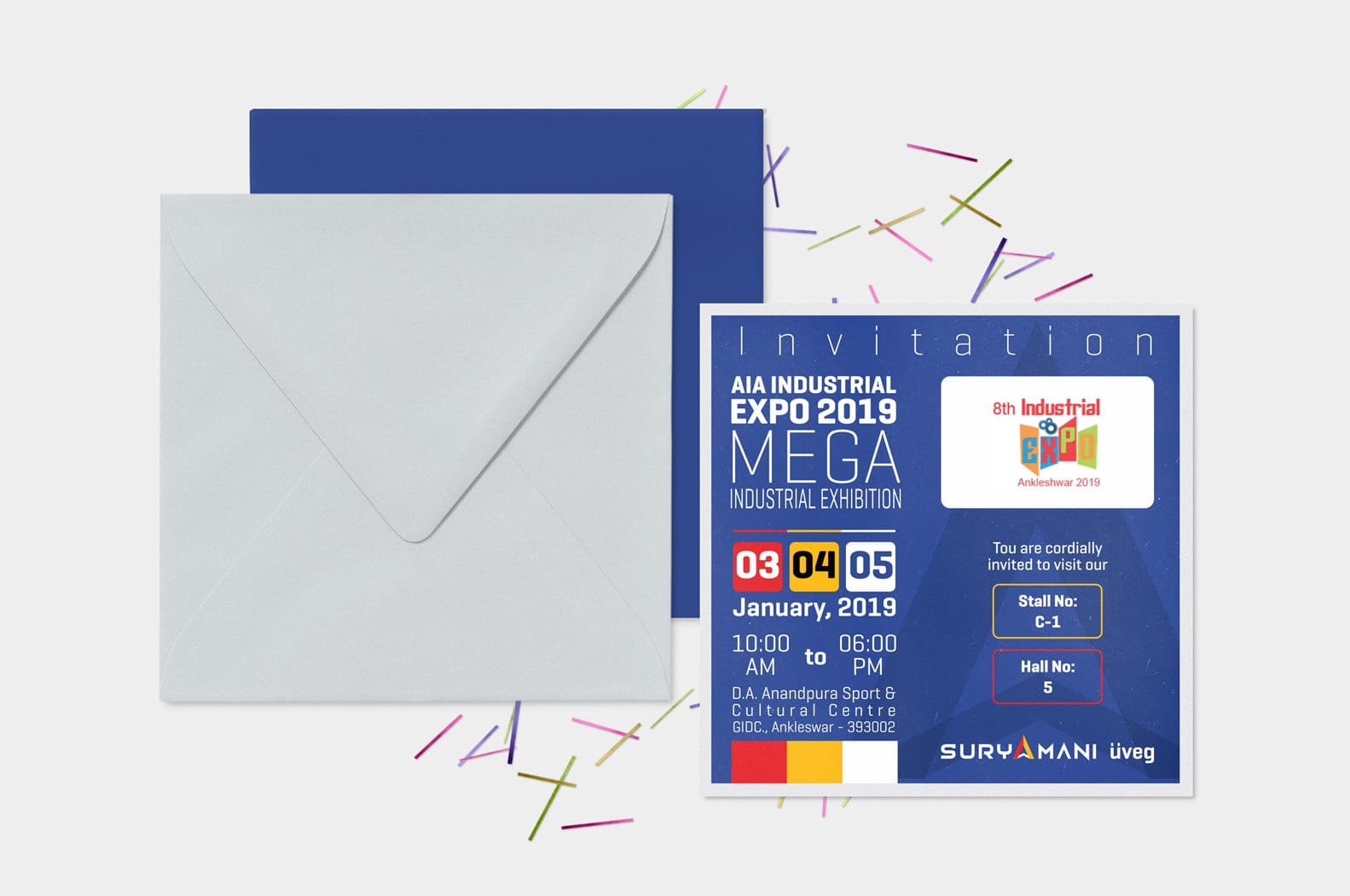
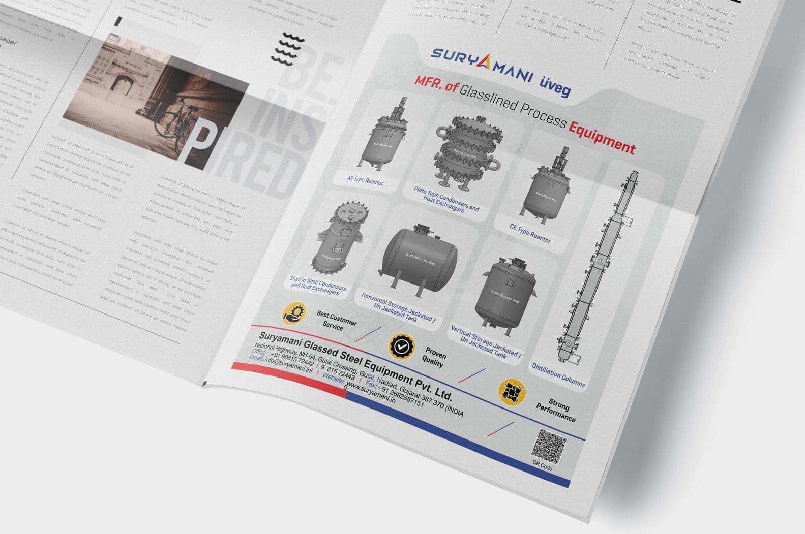
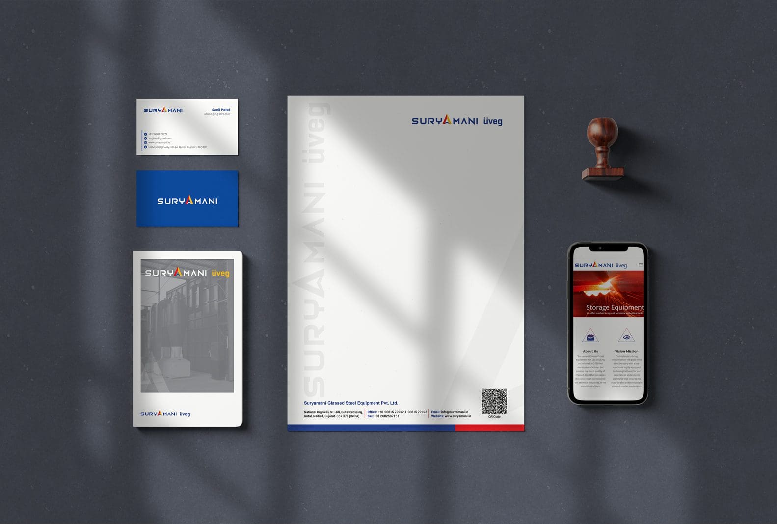
Our new identity brings this to life externally. We modernised Suryamani’s classic logo, and created a graphic system that visualises chaos being ironed out or made digestible.


TEAMS AND CLIENTS FORM A BRAND LANGUAGE TOGETHER
Clients feel more comfortable when they understand the what and the why behind each iteration as well as what they can contribute, influencing the result positively.
While the client’s input is critical, we, as design experts, have a responsibility to share what we’ve learned from our past experiences and explain the current industry trends to help our clients understand our visual choices.
We have noticed that teams that participate in the process and see the evolution of the project throughout its stages tend to believe in and support the result more. As a result, they incorporate the new identity consciously and maintain the uniformity of the visual identity in their future products.
WE TAKE DIGITAL EXPERIENCES
TO THE NEXT LEVEL
With a new strategic direction and visual identity, this is a brand that exudes the warmth and personality needed in our digital age. We’ve set the tone for Suryamani’s future, giving them scope to create more moments of genuine human connection in whatever they do next.
we were careful to retain the spirit and charm of what existed while evolving the brand to appeal to a broader audience.

